Styling
Eace element has different attribution and styling options. Those options change depending on the type of element. However, there are also several common attributes.
Export SDK's system uses flexbox under-the-hood, so many of the attributes you are familiar with in other systems are similar here.
To keep things organized, we've grouped similar options together—things like color, size & spacing, etc. In most cases you will be able to quickly identify the option by opening a section or two.
If you are unfamiliar with flexbox, we strongly recommend you check out Mozilla's Flexbox Guide. Mozilla also has great information on other CSS related principles, such as styling text, in case you need help.
Layout#
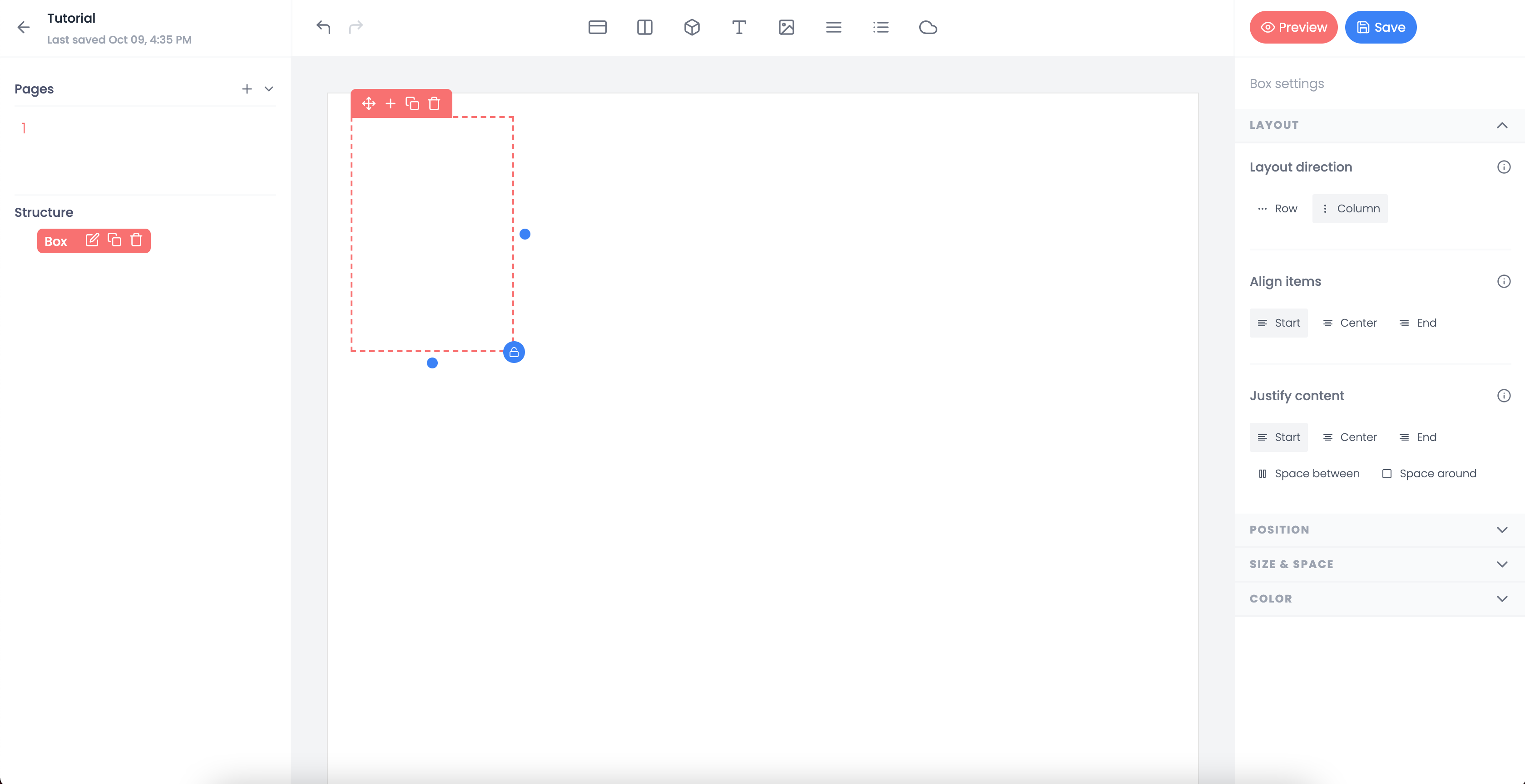
The layout section is typically the first set of options you will see from an element. The primary purpose of this section is to control the flow of your elements.
For instance, if you want the inside element to flow from left to right, you would change the layout direction from column to row.
The 'Align items' and 'Justify content' sections are also very helpful for tweaking the flow of your layout. They work in conjuction with the direction to dictate how elements are displayed.
Let's say you wanted to display the items left to right and center them within the element. To do this you would set the direction to row and adjust the align items to center.
Protip: Play with the prebuilt template called "Understanding Flexbox". It is a good way to play with the different options.
Position#
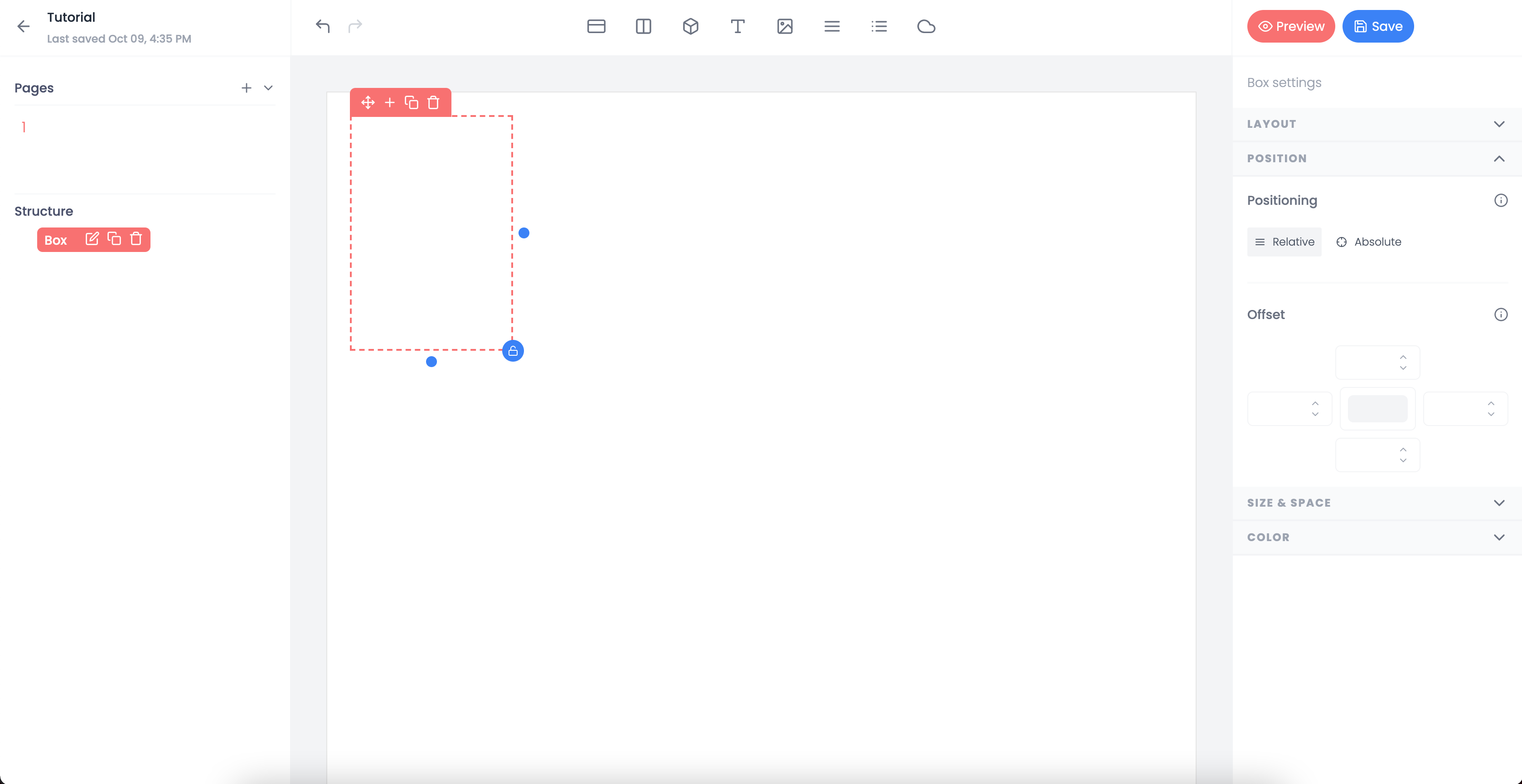
The position is relatively (get the joke!) straight forward. It allows you to tinker with the position of an item positioned with flexbox. This is great if you want to move things over into the margin or have things overlap.
By default the position is set to relative. In simple terms, this means it will follow the typical flexbox conventions.
If you choose to use absolute position, this will allow you to adjust to the top and left properties to mimic x,y coordinates.
Size & Space#
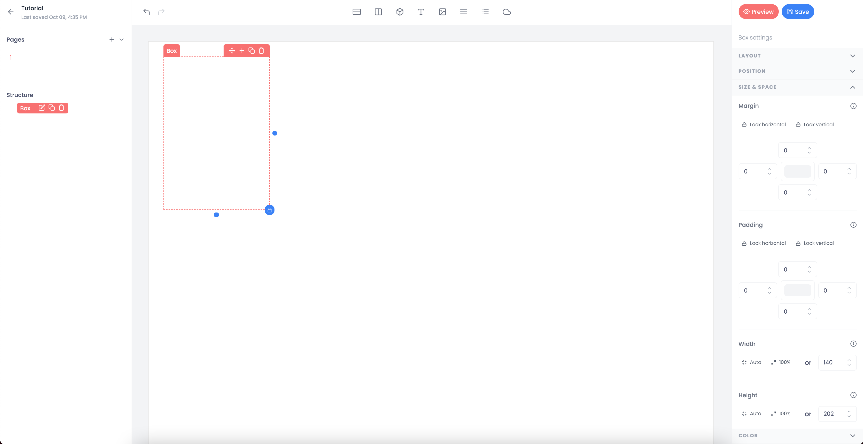
Size & space attributes set the margin (spacing outside of your element) and padding (spacing inside of your element) as well as the height and width of the element.
If you have ever used a HTML editor, the margin and padding operate exactly the same.
Adjusting height and width allows you to maintain absolute size parameters.
There is also the option to set the height and width to be 100% or automatic. In the case of automatic, the properties will be set to contain the elements within plus any applied padding.
Protip: Check out the prebuilt template called "Understanding Size & Space". It does a good job of showing the scenerios you would want to utilize the different options available within Size & Space.
Color#
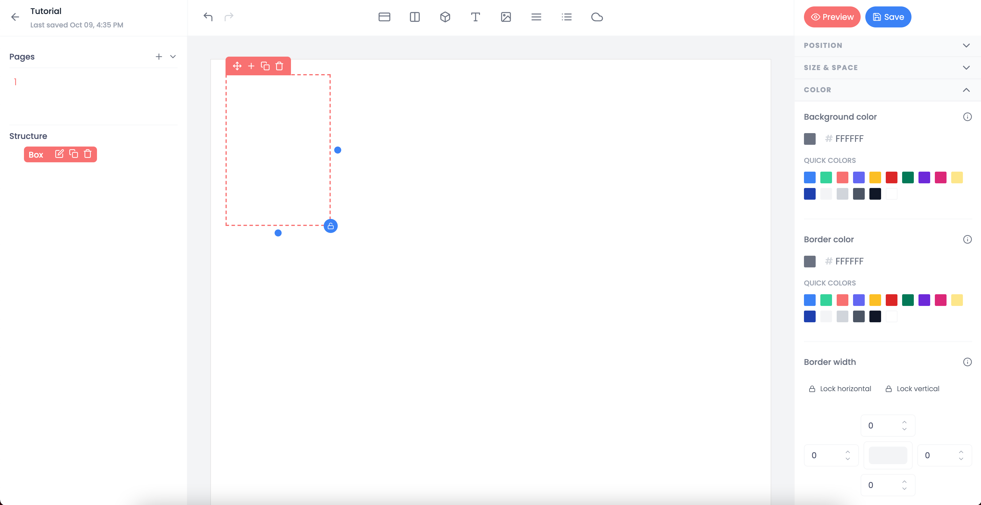
Most of the time your options will be set to a default, such as a white background. However, it may be useful or stylistically appropriate to change the color from time to time.
For most elements, the two areas the colors apply are for the background and for the border.
Note: Text colors will always be located under typography.
Sometimes you may wish to use a background color to specifically highlight an area or use the border color to create a horizontal rule. In either case, this can be done by playing with the color attributes.
Protip: Check out the prebuilt template called "Understanding Color". It will show you ways to get the most of your template's coloring capabilities.
Typography#
Text only
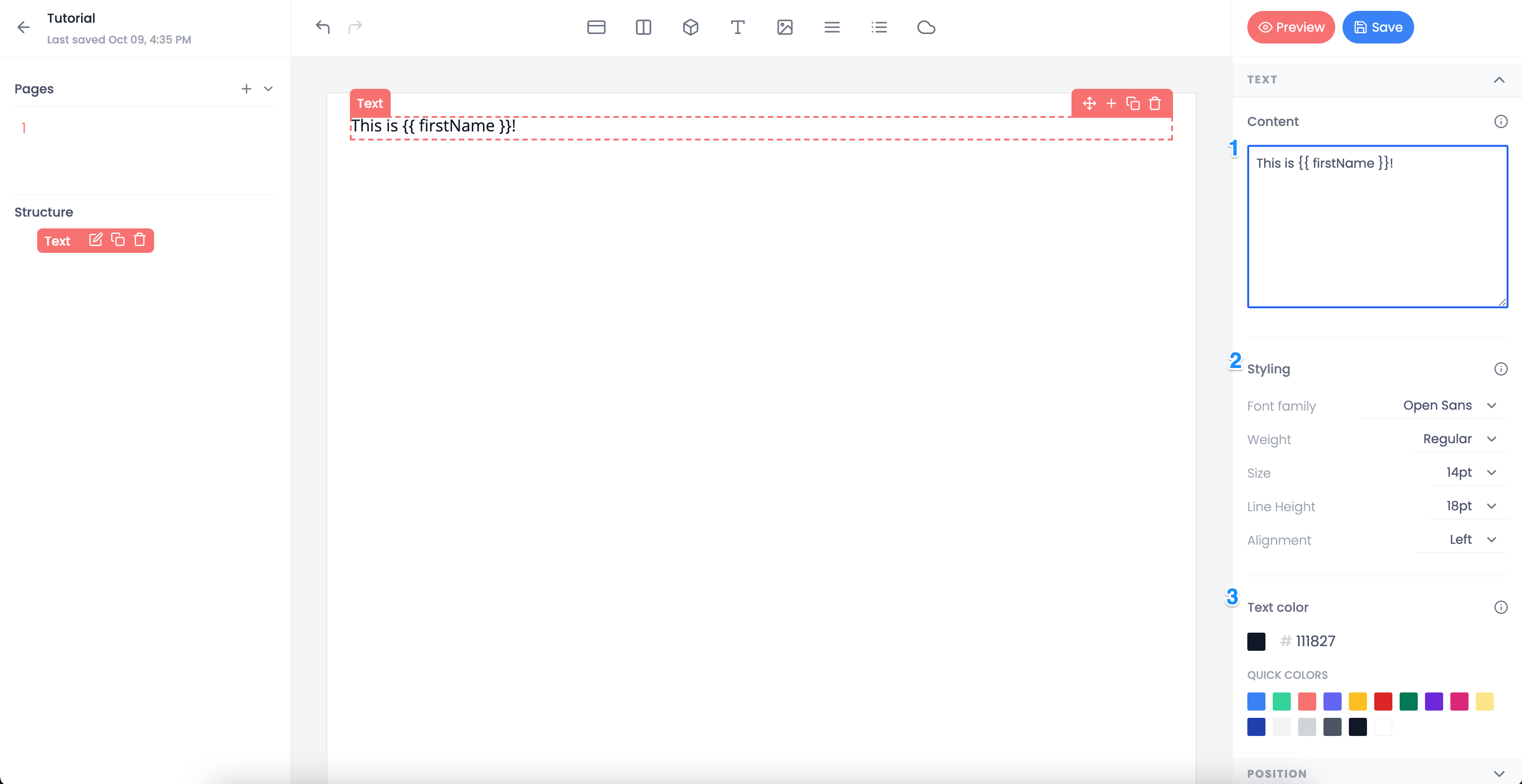
The typography section is only available for text elements. However, a similar set of attributes also exists in the table configuration for columns.
This section is split into three areas.
The content itself (see 1). This is the space in which text is added that will appear in the element. As seen in the example, Handlebars subsitution is possible with the content. The content can be completely static, completely dynamic, or a combination of the two.
The characteristics commonly associated with typography (see 2). These include attributions such as font size, font family, font weight, etc.
The color of the font (see 3). By default there are around 10 default colors, but any hex color code can be used. Once a color is used within the template it becomes an quick option for future color selections.
Image#
Image only
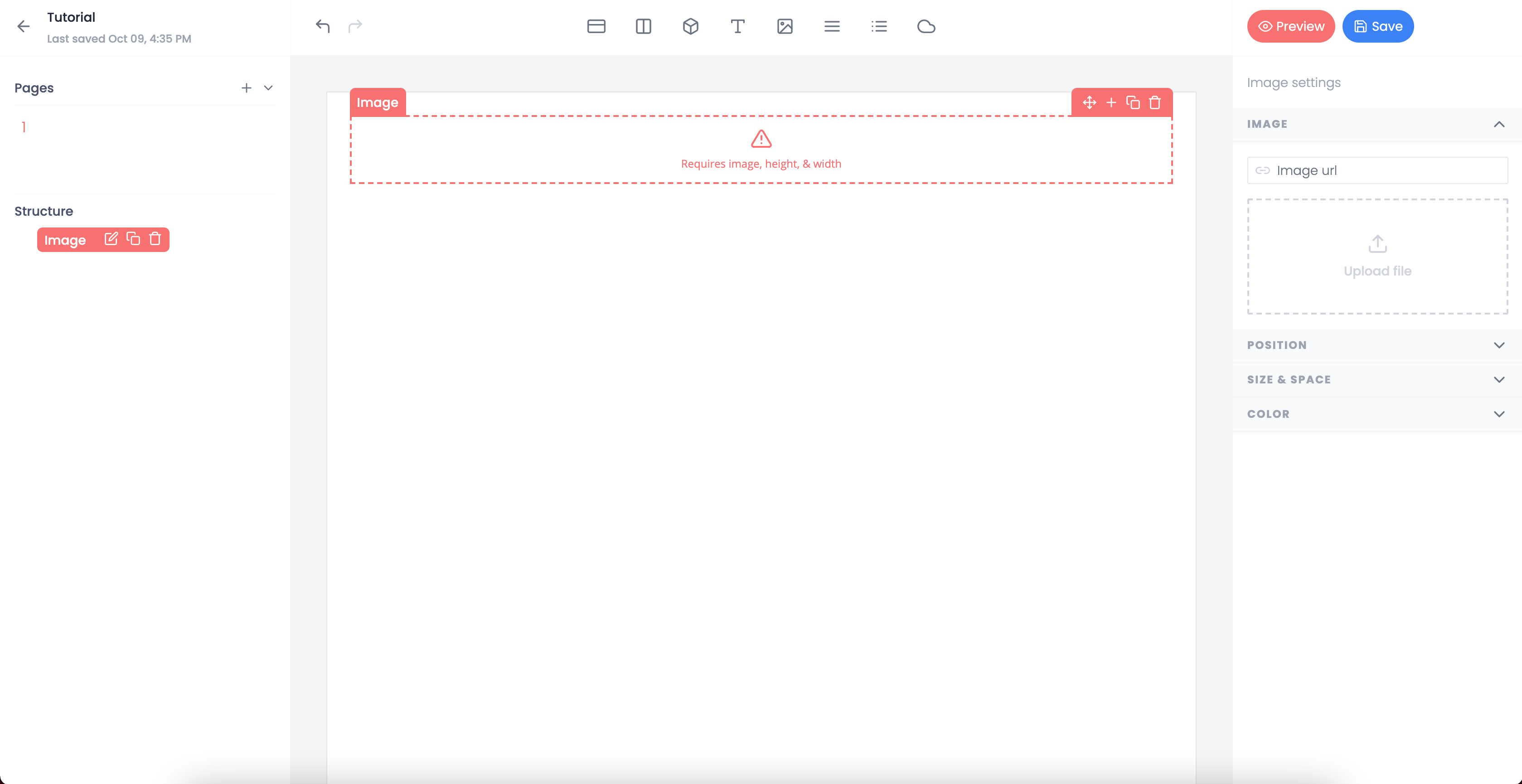
The image attribution section is unique to the image element. It allows for you to set the image source.
On the surface, this section appears to have just two methods of adding an image source, but there are actually three.
Upload an image from your computer locally by clicking the upload area and browsing your local files or by dragging and dropping an image into the area.
Copy and paste a url into the text input.
Use the text input but use a Handlers subsitution string, ex. {{ myPhoto }}.
Table Header & Row Style#
Table only
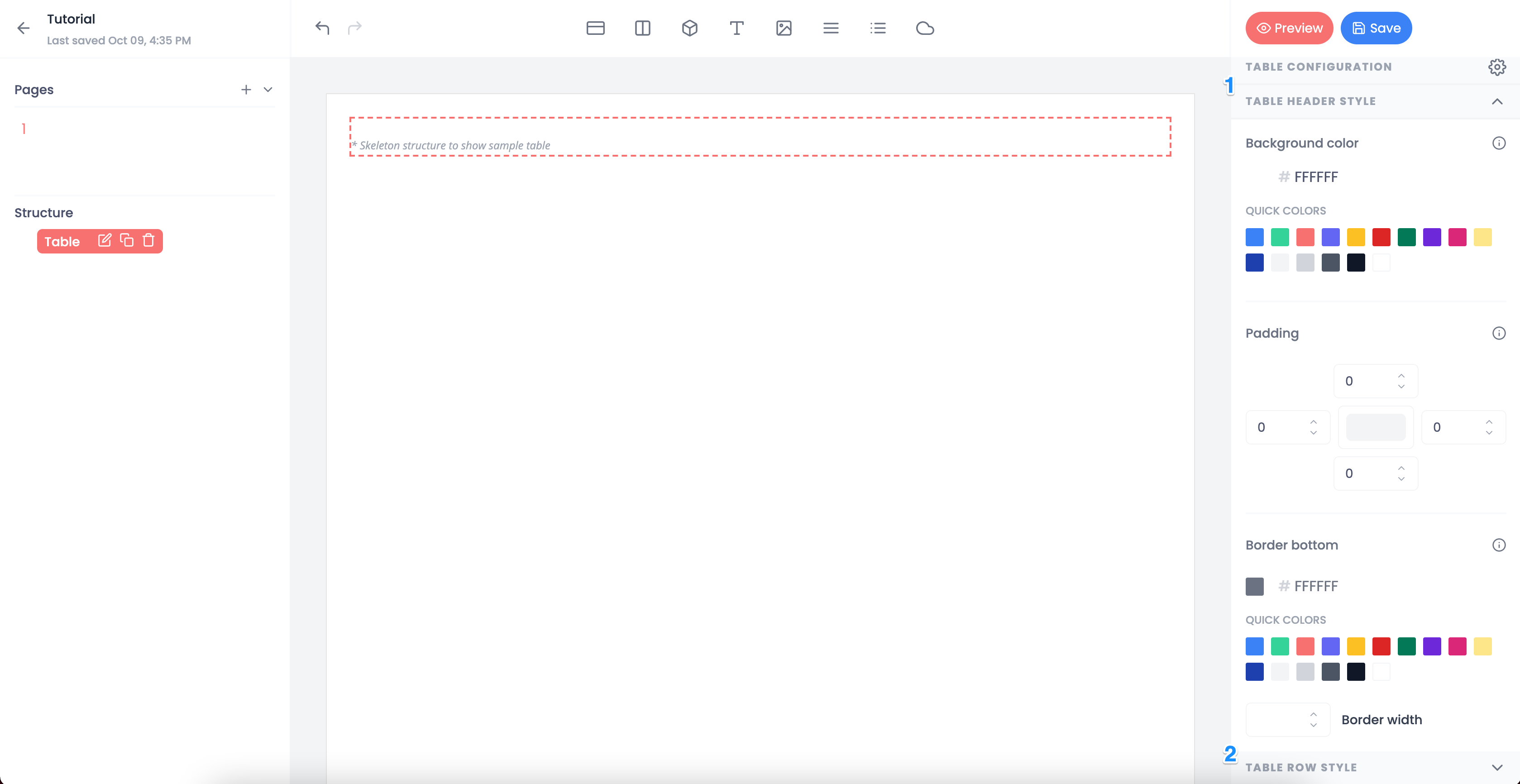
The table header and row style deal specifically with an area of a table.
Within each section are overlapping attributes. The key difference is that the header section only affects the table header and likewise with the row section.
Protip: Check out the prebuilt templated called "Creating an awesome table". It will show you the many ways building an awesome table can be achieved.