Elements
There are several basic elements you can use to construct your templates.
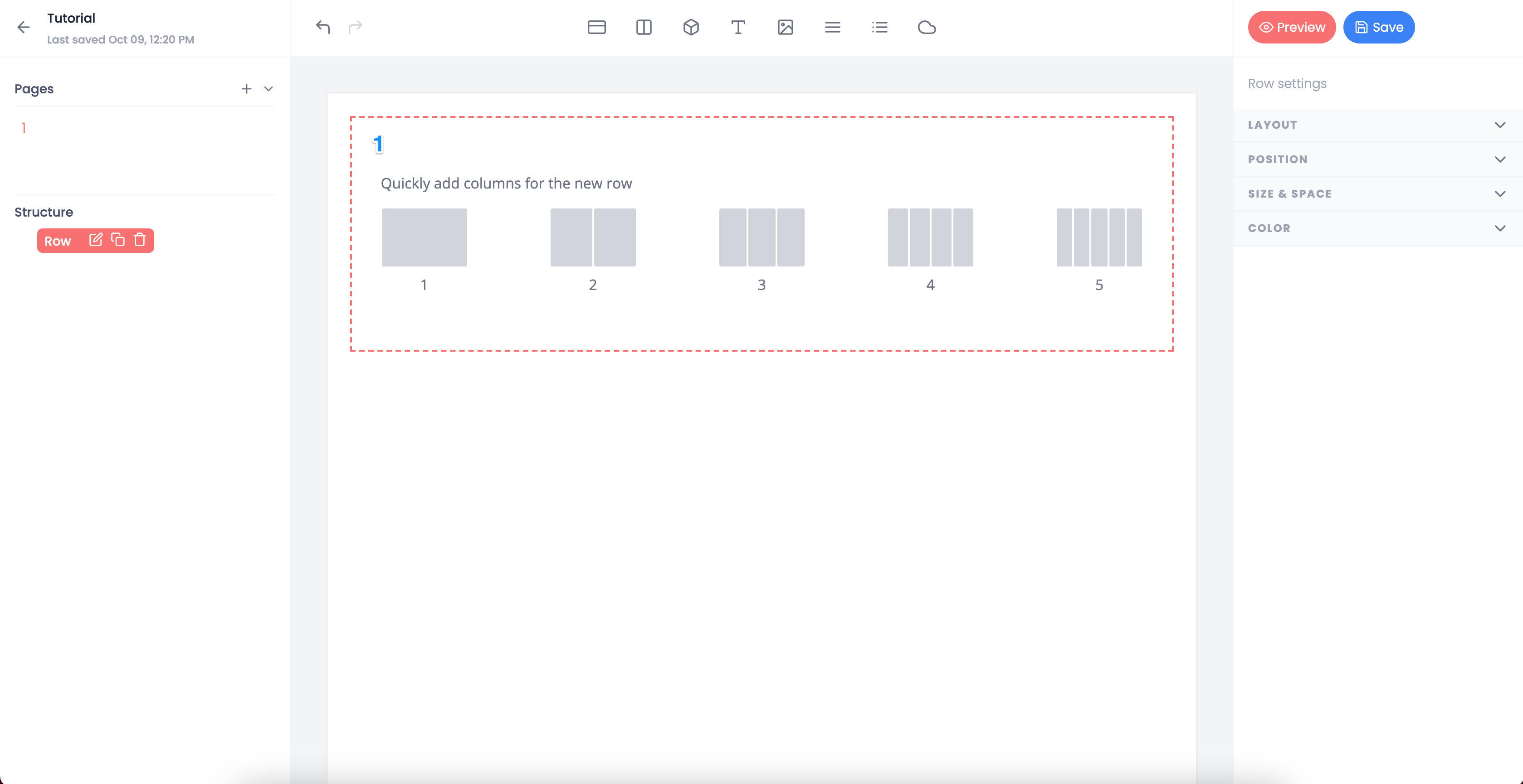
Row#
The row element is similar to a basic container, but is intended to be used with columns. Rows make it easy to build complex arrangements and are a good starting point for creating new sections.
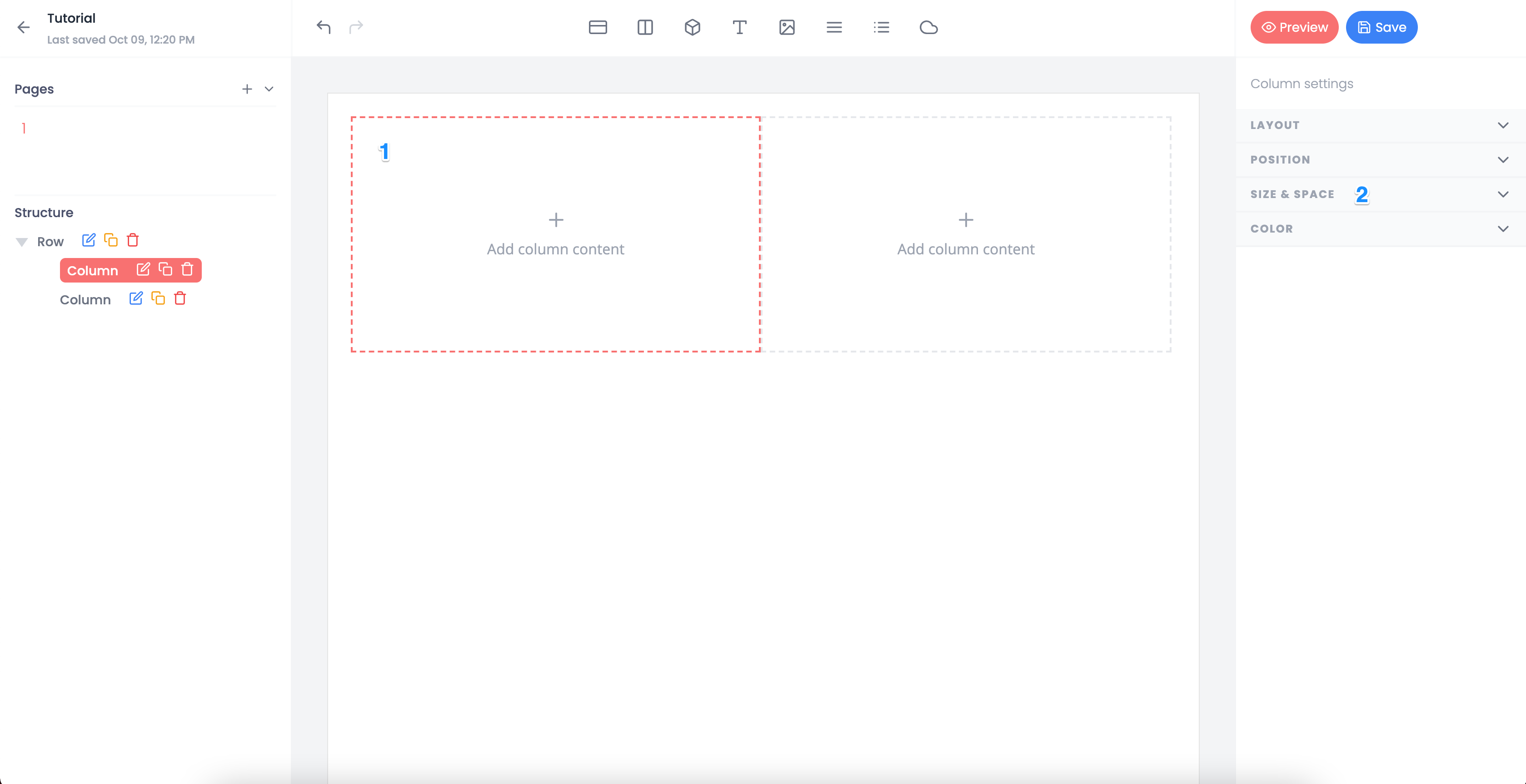
Once you insert an element, you will be able to access columns (see 1). Columns can be added or removed at any time.
Column#
Columns are only used in conjuction with rows. This element create an easy way to have proportioned subsections of the row (see 1).
By default, each column has a weight of 1 which makes all columns equal width. Column width can be updated by adjusting the weight property located under 'Size & Spacing' (see 2).
Box#
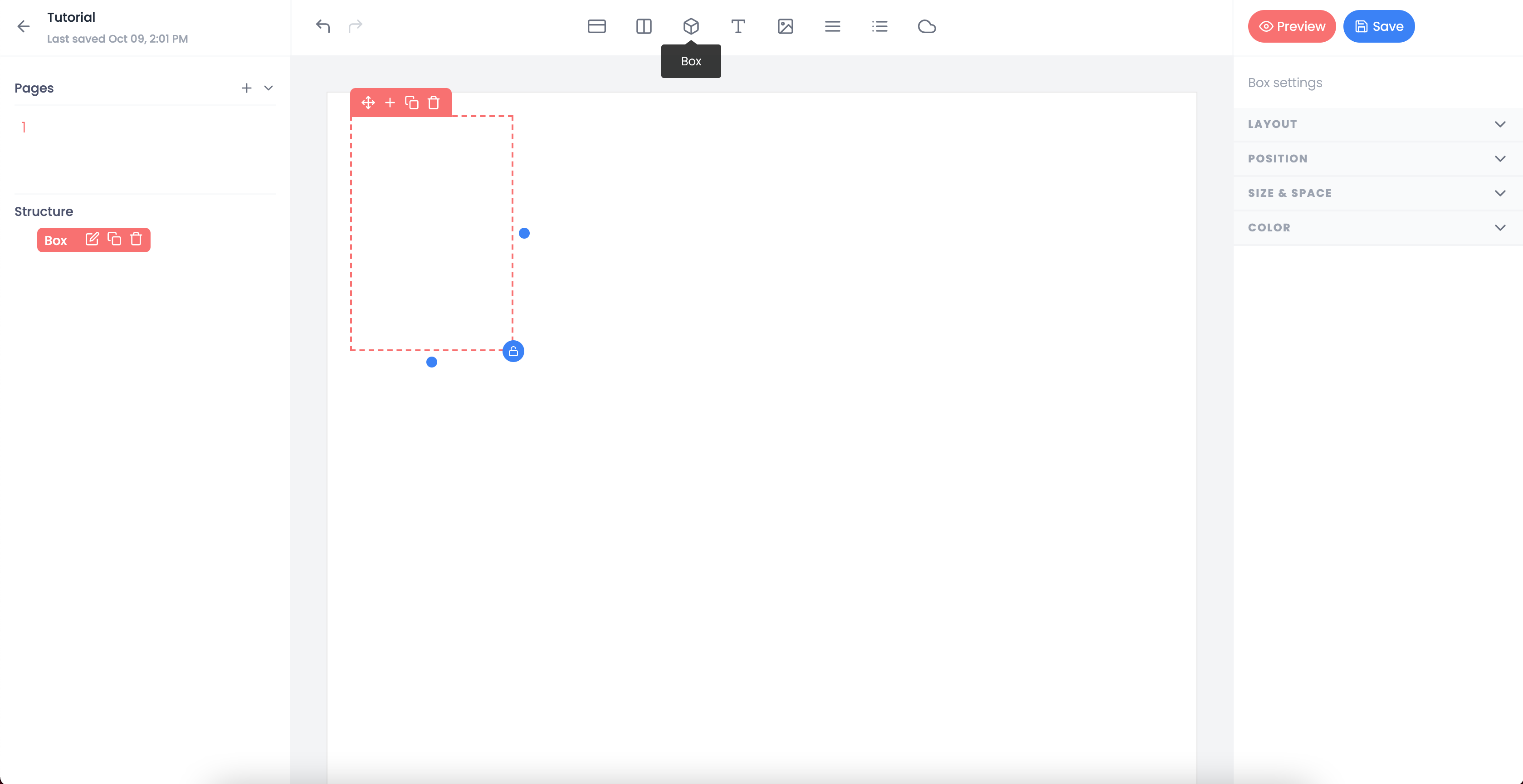
Boxes are containers that hold other elements. In a sense, the element page itself can be seen as a large box.
Boxes are great for grouping elements together. Once inside of a box, they can be moved together as a unit.
Additionally, styles can be applied to the box. This is especially useful if you would like to add a background color, change the padding, or other attributes.
Text#
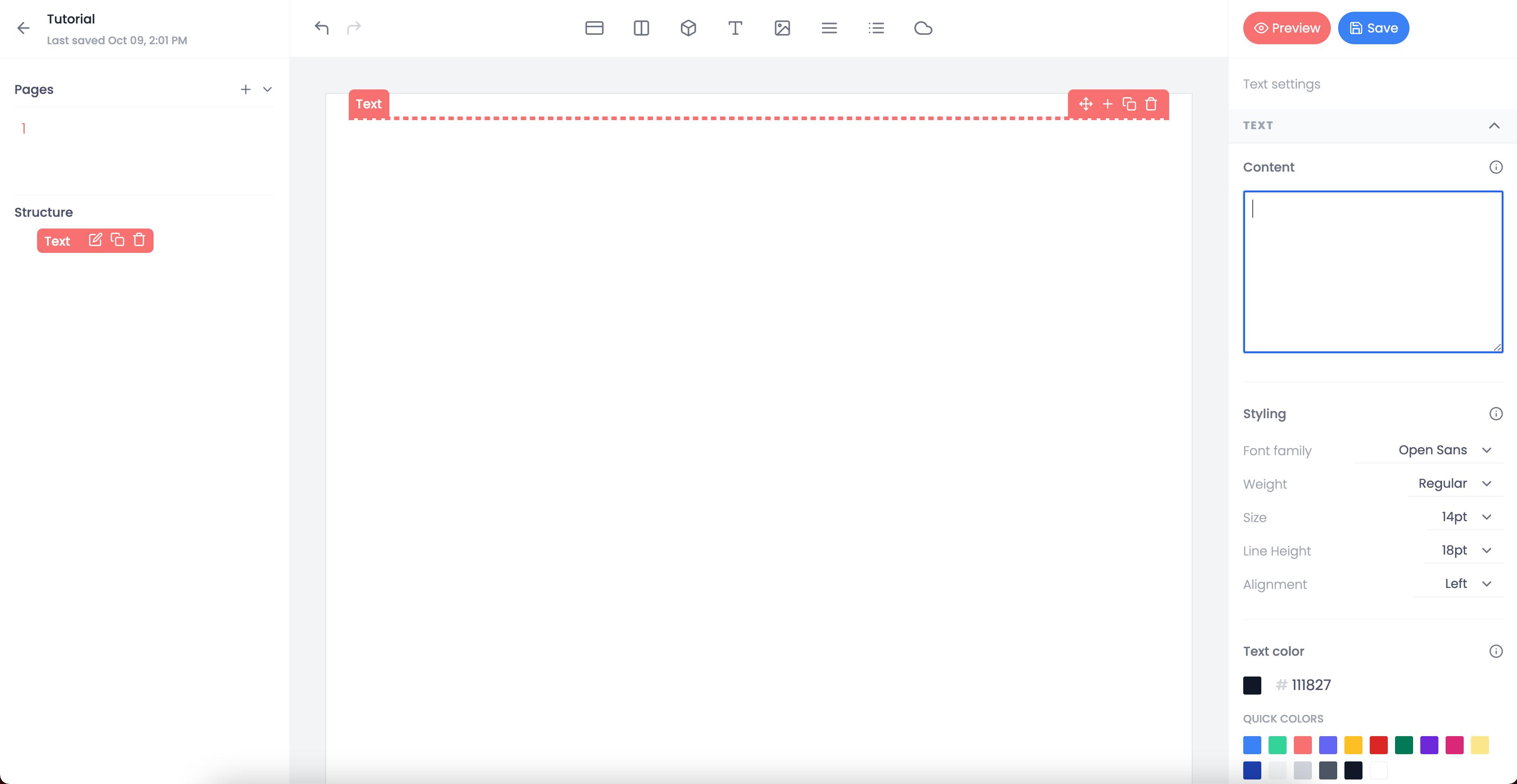
Text elements will likely be what you used most and can contain placeholders for dynamic data.
Our text elements leverage a commonly used templating system named Handlebars to handle interoplation between static and variable content. For example:
This is a greeting from {{ firstName }}. Welcome {{ creator }} to Export SDK.In addition to modifying common styling atrributes—like color and font weight—you can also change the font.
We've designed Export SDK to give you complete control over the style of your document and its elements.
Image#
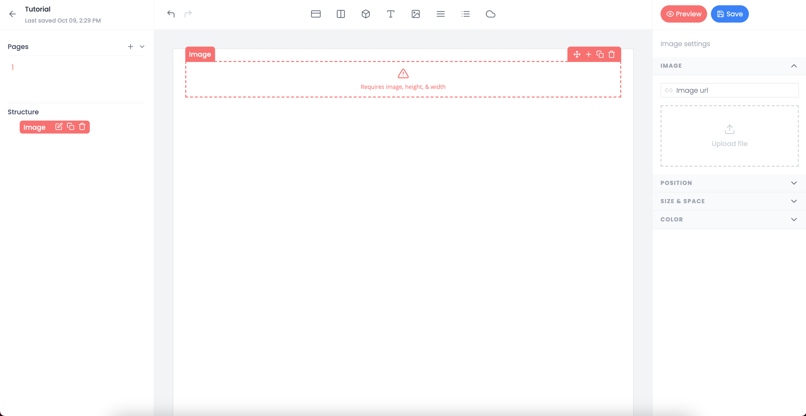
The image element is commonly used for adding company logos or creating dynamic reports.
The editor enables you to upload images directly into your template. You can also use a url.
Like text elements, images also use Handlebar templates. This enables you to send dynamic images to the template rather than using a static image.
Table#
Tables are one of the primary reasons we use flexbox for elements and styling. Most PDFs contain dynamic list data which is typically displayed in tables.
With Export SDK, you don't have to worry about exceeding hard set x,y constraints. You can send as many rows to a table as you need.
This is especially powerful for invoices or receipts where the number of line items are unknown while creating your template.
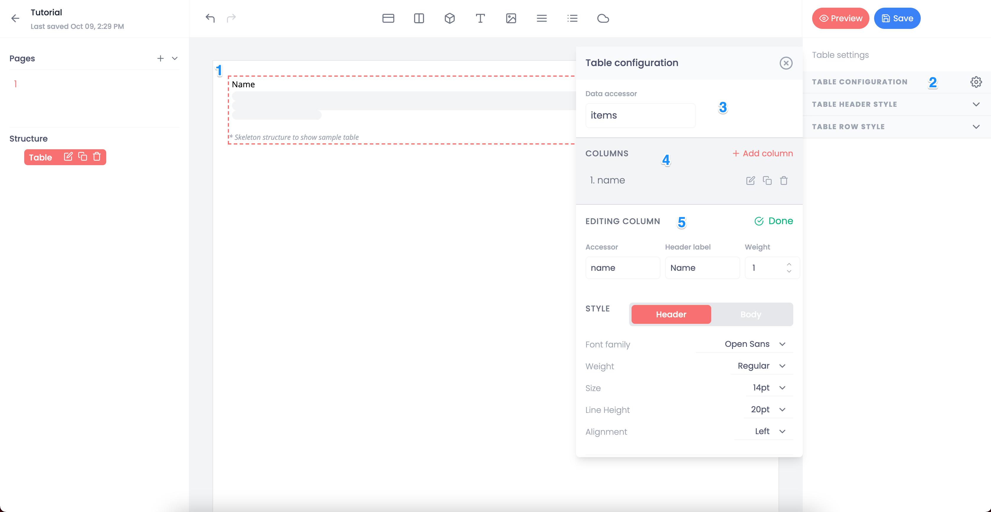
To create a table, select the table element from the header. Once the table is inserted into the canvas, a skeleton will appear that represents a mock up of your table (see 1).
On the right side, you will see the option for the table configuration (see 2). This is where you will setup everything from the column headers to the field within your payload that will contain your tabular data.
Within the table configuration, you will add the data accessor and columns (see 3 and 4). Export SDK expects to receive a JSON field that contains an array of consistent objects. Such as:
{ "items": [ { "name": "Aaron", "age": 35, "height": "5ft 10in", }, { "name": "Allen", "age": 45, "height": "5ft 0in", }, ... ]}You have the ability to specify a object accessor and change the title displayed in the template (see 5).
Export SDK only maps data that is specified in the configuration. Any extra data you send that has not been specified will be ignored.
In the event that a field is missing, the resulting output will be a blank string.
When the rendering process occurs, Export SDK iterates over the items listed under that field and outputs your table.
After you've defined a column, you have the ability to change the typography for headers and body of each column.
Pro Tip: If all of your columns will have the same styling, we recommend completing the first and then using the duplicate functionality.
List#
Similar to the table element, the list is used for dynamic list data.
The idea is simple: One element that's repeated for every data object within your payload. Want to show a bunch of user profiles with thumbnails and names? A list is a great way to do that.
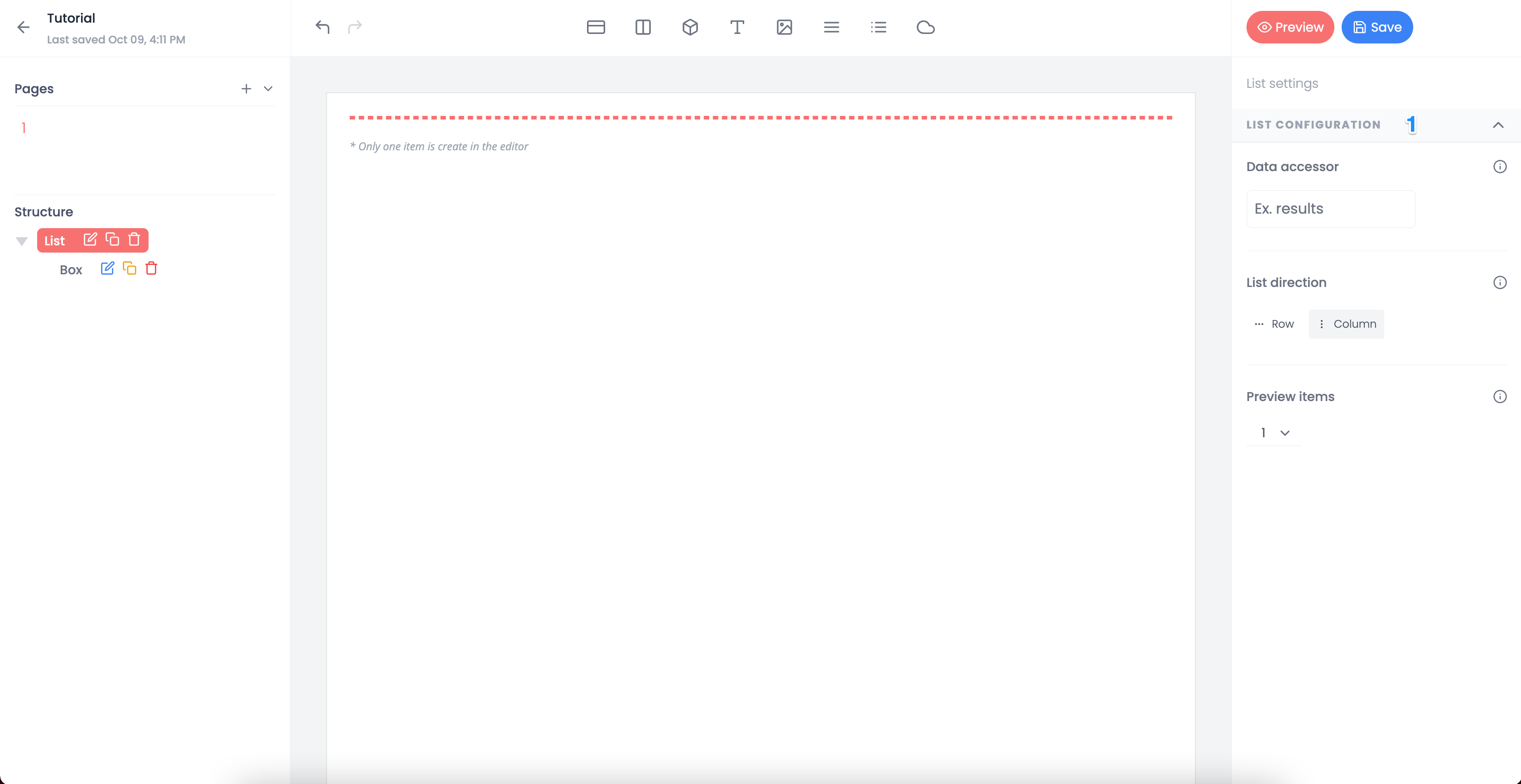
Once you insert a list, the options to configure the list will be available on the right side (see 1).
Since the focus of a list is to build a customized element that will be repeated, the configuration options are minimal.
The most important option is whether you want the repeated element to span horizontally or be listed vertically.
In the event that the element is to be repeated horizontally the elements will populate on a new line once the horizontal space is used.
Floating Box#
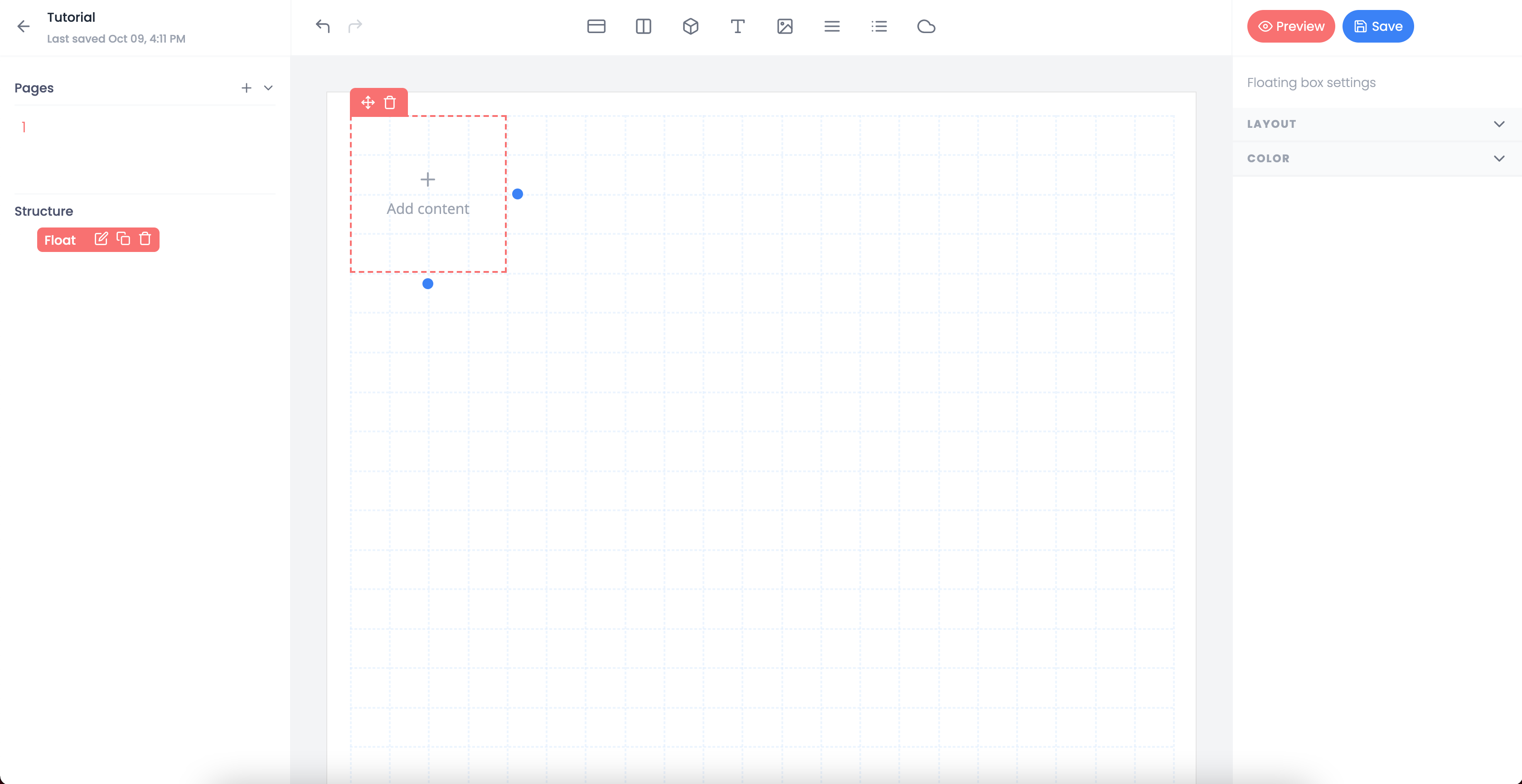
The floating box element is very similar to a box element. It serves as a container.
The biggest difference is that a floating box has the ability to be positioned anywhere within the page using our grid system.
Most of the time, the best way to build out a dynamic template is to use the elements within a flexbox system. This works really well when the shape of the data is unknown at the time of creation.
However, sometimes it's best to absolutely position an element. This might be for styling reasons or because the element works best outside the constraints of the flexbox system.
Whatever the reason, the floating box allows you to place a container anywhere.